Themes Page

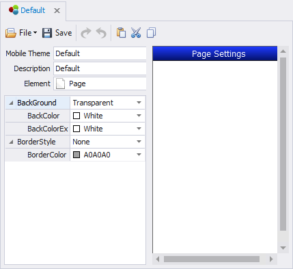
The Theme Page element sets the basic look and feel theme for page(s) added to application forms in the Solution Designer.
As like any other control, the values here are inherited by the page control in the Solution Designer if the Page's Active Theme = (Default).
BackGround Property - has four categories for setting the background color: Solid, directional, Transparent, and None. Solid applies BackColor and ignores BackColorEx. The Directional (Diagonal Right, Diagonal Left, Vertical etc.) applies BackColor and BackColorEx in a gradient direction. Transparent allows the background color from next closest parent or container behind the control to show through. None is similar to transparent as it ignores both BackColor and BackColorEx. Most controls will also have a (Default) value that appears in colored text. This value uses the Theme > Application > BackGround settings.
Bevel Property - sets the curvature of the corners of the page. You can set the values from 0 (90 degrees)l and makes the page look oval.
BorderStyle Property - adds a border to the perimeter of the page. The values are: (None), Flat, Sunken, Raised, Thick, and Underline.
DropShadow Property -places a dark border around the bottom and right sides of the control for a 3D effect.